The Melton Clinic
1-The Challenge: Creating Signage That Complements Counter Fascia
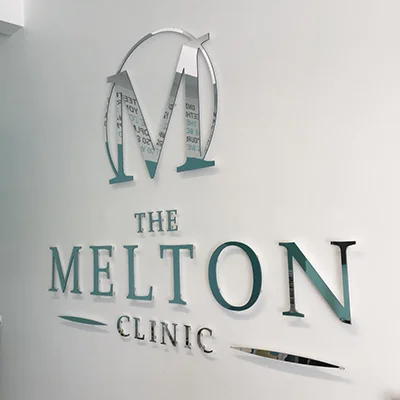
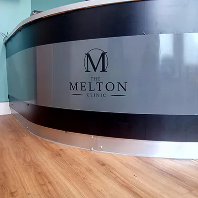
The Melton Clinic sought signage that reflected their high standards of care and modern approach, while perfectly matching the design of their existing counter facia. The key challenge was to produce signage that was both polished and cohesive with the clinic’s interior, enhancing the space without overpowering it.
2.The Transformation: Designing a Cohesive, Sleek Signage Solution
Assessing the Existing Design:
We started by carefully evaluating the clinic’s interior style and counter fascia materials, colours, and textures to ensure the new signage would blend seamlessly.
Developing a Professional Brand Identity:
We crafted a modern, sophisticated brand identity with a sleek logo and a refined colour palette that conveyed trust and professionalism.
Designing the Signage:
Using high-quality materials and minimalist styling, we created signage that complemented the counter facia and overall clinic aesthetics, featuring the logo and key information in a clean, elegant format.
Ensuring Design Consistency:
Materials, finishes, and placement were meticulously matched to the counter fascia to maintain a unified and balanced look within the space.
Implementation and Installation:
We managed precise, secure installation to preserve the integrity of both the signage and the counter facia, ensuring a flawless finish.
3.The Result: A Harmonious and Professional Presentation
The final signage solution perfectly matched the counter facia, elevating the clinic’s interior with a sleek, professional look. This cohesive design helped create a welcoming, high-quality environment that reflected The Melton Clinic’s commitment to dental excellence. The project highlights our ability to deliver tailored signage that aligns seamlessly with existing design elements, reinforcing brand identity and professionalism.


